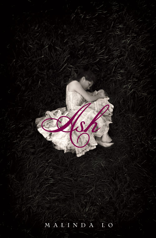
Introducing the cover of ASH
After months of waiting for final approval from my publisher, I am so excited to show you all the cover of Ash! Behold its total gorgeousness:

Isn't it spectacular? Sure, we all say you shouldn't judge a book by its cover, but I know that a cover can make someone take notice and pick up a book. And I would definitely pick up a book with this cover (even if it was not written by me!).
It was designed by the talented Alison Impey, who has also designed the covers of Sara Zarr's Sweethearts, Wendy Maas' Every Soul a Star, Simon Holt's The Devouring, Suzanne Phillips' Burn, and the upcoming Prophecy of the Sisters by Michelle Zink.
In honor of the release of Ash's cover, I've asked Alison Impey a few questions about her design process.
Malinda Lo: When you begin conceptualizing a book cover, what sort of process do you follow?
Alison Impey: When I first read a manuscript, I'm immediately looking for imagery and moods that are specific and unique to the book. I try to focus on the themes that carry through the story. I usually read the manuscript once for the overall feeling of the book and a second time for finer details that I may have overlooked the first time. I then brainstorm a list of everything and anything that comes to mind. I usually try to keep the items on the list to single words, themes, adjectives, moods, etc. Then I start collecting imagery, anything from stock photos to magazine clippings. Once I've done that, I hone in on what's most essential and most compelling.
I should mention that before this process, I briefly meet with the editor to ensure that I understand the audience and how we plan to position the book—is it a romance, a thriller, etc.—and also what the target age group and readership is that we’re trying to appeal to.
 ML: When you were designing the cover for Ash, what did you want the cover to say?
AI: Elegance. It simply had to be beautiful, magical, and intriguing. It is after all a fairy tale. Sleep—or rather the shift in consciousness—seemed crucial to the way in which Ash experiences both the world she is born into and the fairy world that she is drawn to. At times, Ash herself seems to wonder how she got from the fairy world back to the bleak surroundings of her stepmother’s home. Ash’s belief in the fairy world and her ability to dream is what gives her strength, but it also makes her vulnerable to the cruelness of her stepmother. I wanted to capture that duality: strength and vulnerability.
ML: How did you find the image of the girl on the cover? Were there other images you discarded before choosing this one?
AI:I had begun searching for images that had to do with sleep. As my process above may suggest, I end up collecting a lot of imagery. Some covers see many, many variations and directions before a final decision is made, and in the wake of all the creative fury you’re usually left with many discarded designs and images.
The image that I found for Ash I had actually come across awhile back while searching for images for another title. It wasn't at all appropriate for the title I was then working on, but I so loved the image that I held onto it, tucked away in a folder on my computer. I did not immediately think of it when I read Ash, but once I found myself searching for images of sleep I was ecstatic to find that I’d had the perfect image all along. It was in many ways one of those lovely, serendipitous moments that every so often graces a designer.
ML: It sounds like the cover for Ash came together pretty smoothly; there weren't a lot of discarded attempts. Is that correct?
AI: Yes, the cover did come together smoothly. However, I did do a lot of variations of the cover before deciding on the current composition, type, color, etc. Early on I had a few other ideas going, and a number of different images I had considered.
ML: Do you think you have a particular style or aesthetic that goes into your book covers? If so, how would you describe it?
AI: That's a tough one. I design a range of books from picture books to young adult novels. It is always important to be conscious of what’s right for the book and not impose a style just because it might be a personal aesthetic. However, I do believe we all develop certain aesthetics that find their way into a design. Like purple. It's somewhat of a joke with some of my colleagues that I use purple a lot. But with that said, it’s important to continually push the boundaries and keep things fresh.
—
Thank you, Alison, for giving Ash such a great look. What do you guys think of it?